
Chromatography
Published:
Just want to know how to actually use the thing? Jump here
The habit
I have a quiet colourful habit. Whenever I’m selecting colours for a slide presentation, a poster, or data visualisation for a paper, I start digging through my own photos.
A plum red taken from Uluru at sunset, the blue of the ocean at Bar Beach, a green from the back of a king parrot. This personal touch feels satisfying, even if no one else knows where the colours came from (or, likely, they don’t even have a conscious thought about the colours at all). It’s a fun way to re-engage with something I created in the past (which would otherwise tend to sit underappreciated in my photos app), and remix it into something completely new.
And honestly? I find that the results are typically as good as, or better than, off-the-shelf palettes from the usual online sources. Often, I’ll spend time trawling through sources like ColorBrewer (excellent resource, not knocking it), but whatever I pick will feel unsatisfactory in some way, or just too generic. After some time of being overly particular about my colour choices, I’ll find myself going back to my photo collection to find something that really hits the spot. I suppose that a palette which emerges from a real photographic composition will have a particular kind of internal coherence that hand-composed palettes often struggle to replicate. The colours coexisted in a real place, sharing the same light and atmospheric conditions, and they already caught my eye when I framed the shot in the first place.
This process, though, has always been slow, manual and non-replicable. I’ll scan my photos for one that broadly has the kind of palette I’m after. I’ll take in the details of the picture and use macOS’s Digital Color Meter to find the right pixels with the colours I want. Then I’ll take note of the RGB values, one at a time, convert to hex, and paste into my R script, CSS or whatever. I don’t record which photo was used to create the palette, so next time I start a project a few months down the road, I’ll either copy the palette I used last time (losing the personal touch, since I forgot where it came from) or start the whole process anew with a different photograph.
Lately, I’ve been on a mission to codify something of a ‘visual identity’. Partly for (erm, wanky) self-promotional reasons, but also with the practical aim of reducing the amount of time I spend agonising over minor, recurring design decisions when I’m writing talks and making things.
I created this app initially for personal use. I just wanted something to help me craft attractive, personal colour palettes from my own photography, make tricky colour swatch decisions once, and save the output for safe keeping. It turned out kinda cooler than expected though, so now I’m releasing it publicly.
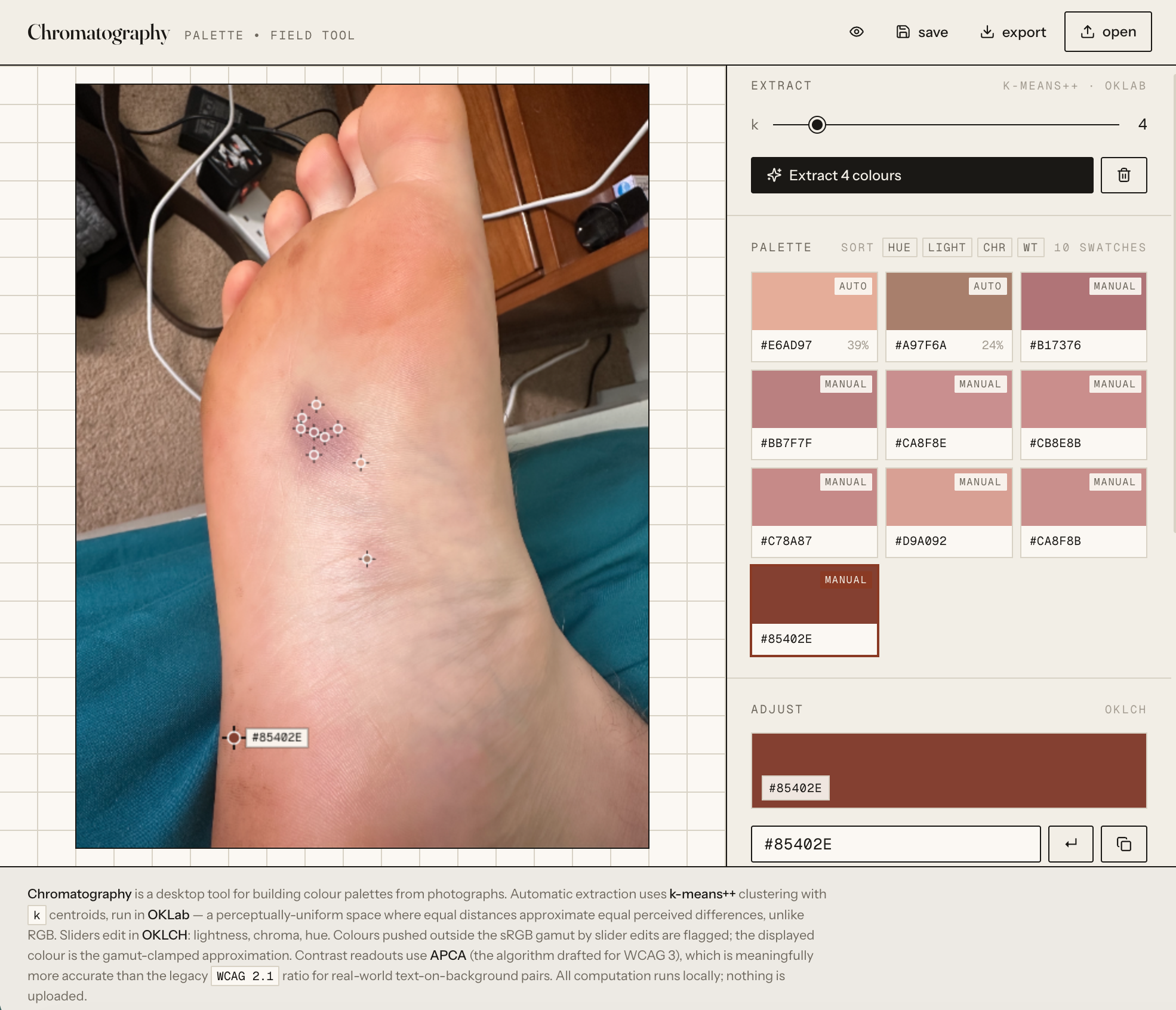
Chromatography
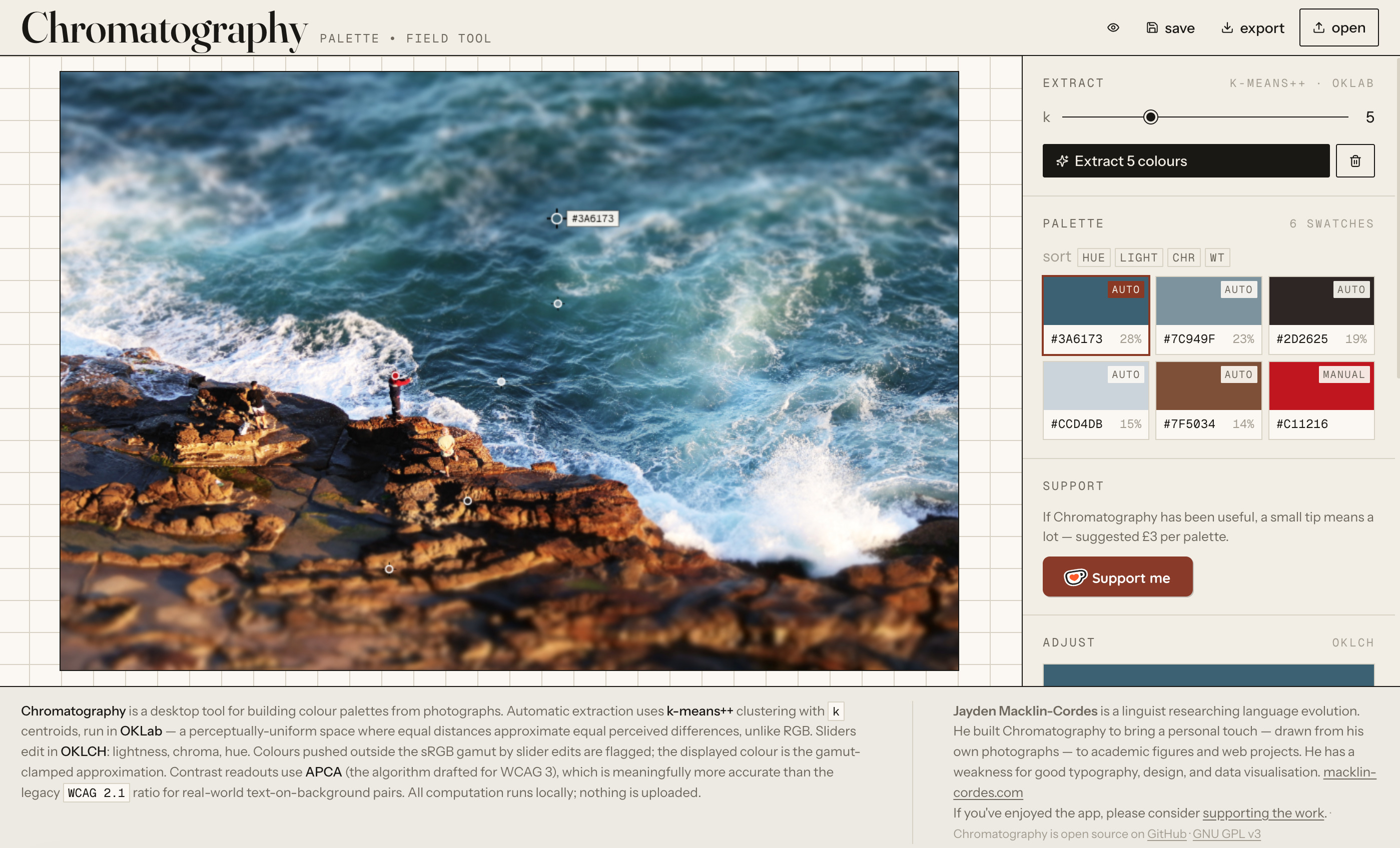
Chromatography is a free, browser-based tool for pulling colour palettes out of your own photographs. You drop in an image and tell it how many colours you want. The app extracts a palette automatically, and you can then refine that palette. You can sample additional colours with an eyedropper, drag/reorder swatches, adjust lightness or hue with sliders, and check contrast ratios for accessibility. When you’re happy, you can export the result in a variety of formats: CSS, JSON, R snippet ready for ggplot, GIMP’s GPL, Markdown, or a standalone HTML guide. Everything runs locally in your browser. No images are uploaded to a server. There is no backend, no bloat, no paywall/freemium model, and no account to sign up for.
To reiterate, I started this project for myself. I just wanted to do my thing — extract a palette from my photo of choice, potentially tweak it, and save it for future use — without the friction of my usual manual method. It wasn’t intended to be a public-facing product. Pretty quickly though, it started to feel like something with the potential to be a unique, useful app. The ability to straightforwardly extract a palette from an image in this way, with the combination of perceptually-correct colour handling, sub-pixel manual sampling, modern contrast scoring, gamut feedback, and multi-format export, to the best of my knowledge, isn’t really matched by comparable free tools nor potentially even paid ones. And the whole application fits in a single React component under 100 kB.
How it works
If you want to extract a palette from a photograph automatically, the naïve approach is: look at every pixel, cluster the pixels into N groups based on how similar their colours are, and pick a representative colour from each group. This is basically what every palette-extraction tool does. The interesting questions are (a) what do you mean by “similar”?, and (b) how do you cluster?
Consider similarity first. Computers by default represent colour in RGB space, which is how your monitor mixes light to produce the picture you see. RGB is convenient because it maps onto hardware, but it’s a poor representation of human perceptual difference. In RGB space, a colour is represented by a set of three values, specifying how much Red, Green, and Blue to mix. Two pairs of RGB triples that are the same Euclidean distance apart can look wildly different to the eye — a shift of twenty units in a dark blue might be barely visible, while the same shift in a bright yellow might look like a completely different colour. If you ask a computer, which only knows colours as a set of RGB numbers, not as we humans really see them, it’ll produce a set of nicely spaced RGB number values, but those won’t actually correspond to anything we’d see as a well-balanced colour palette.
What you want is a colour space in which equal (numeric) distances correspond to equal perceived differences. There’s been decades of work on this in colour science, and arguably the current leader is OKLab, introduced by Björn Ottosson in 2020. OKLab is designed so that its coordinates align with human perception, while addressing some of the drawbacks of older perceptual spaces (e.g., CIELAB, CIELUV) particularly relating to hue and lightness. Chromatography does all of its clustering and comparison in OKLab. When you see a palette extracted from one of your photos, what you’re seeing is the result of asking: of all the regions of perceptual colour-space this photo occupies, where are its natural centres?
The clustering algorithm is k-means++, a small but important refinement over vanilla k-means. Vanilla k-means picks its starting centroids at random, which can land you in terrible local minima: you extract a palette, two of your six colours turn out to be nearly-identical shades of the same thing, and a whole region of the image goes unrepresented. k-means++ picks its starting centroids probabilistically, with new centroids preferentially chosen to be far from the existing set. Very little extra computational cost, but much better starting conditions.
The manual sampling and editing side adds an extra layer of control over the whole process. This is one point of difference from many of the other palette extraction tools online, which just give you an automatically-extracted set of colours and then you have take it or leave it. I think it’s important to remember that there isn’t a single, deterministic, mathematically optimal solution to picking a set of colours from a photograph. There’s still room for a little art in the science of colour palette extraction. And what looks good in a photograph is sometimes not precisely 1:1 with what works in data visualisation (especially where sequential or diverging palettes are concerned).
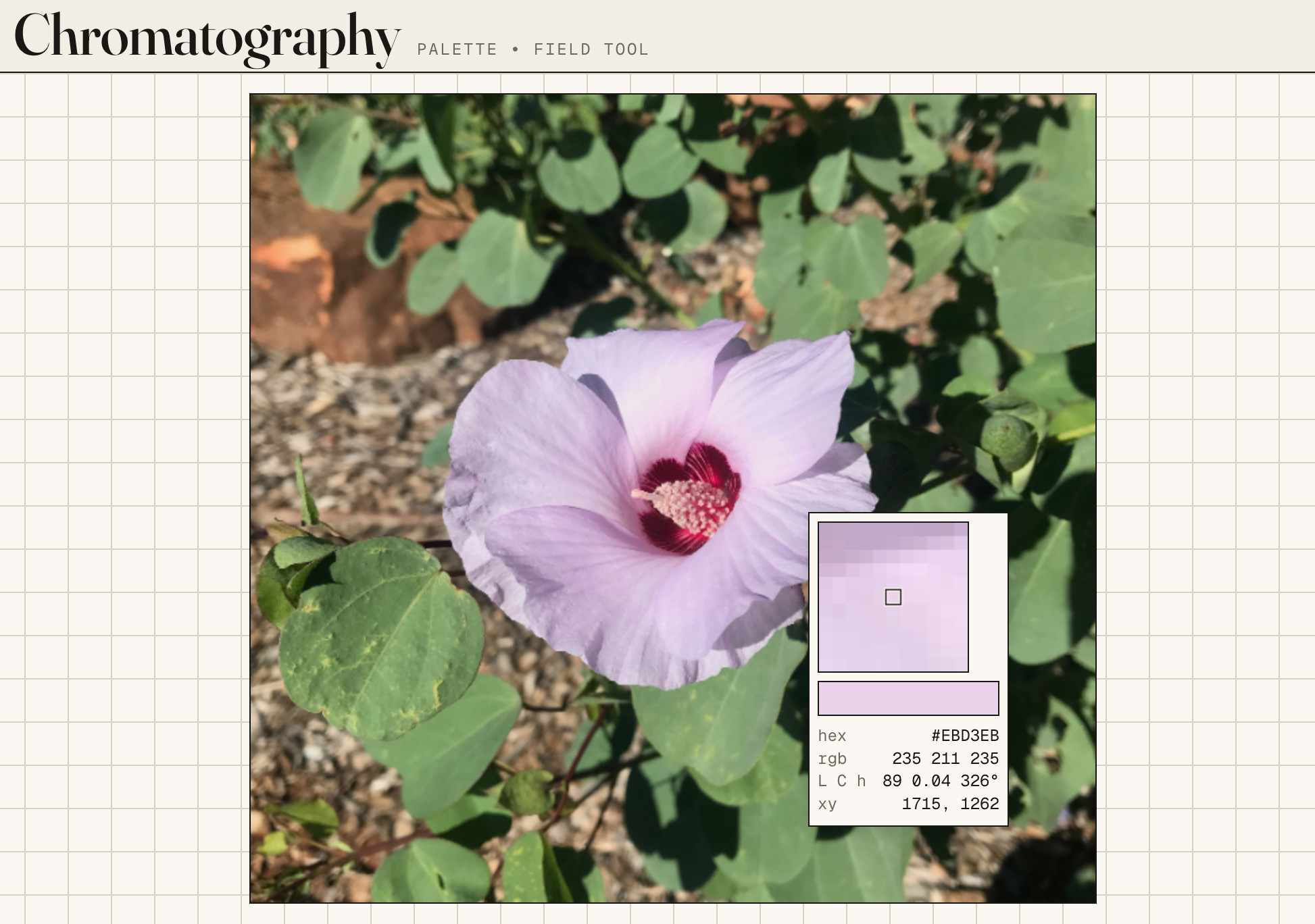
The loupe feature displays the colour under your cursor, computed at sub-pixel resolution by interpolating between the surrounding pixels. Click to add the colour to your palette. I deliberately designed it so you can’t click and drag an existing point on the picture. If you have a colour that is nearly but not quite right, the correct approach is to scan around nearby in the image, find something you’re happy with and add it, then delete the previous one from your palette. This prevents shifting an existing colour in the palette then being unable to recover it again if you can’t find something better nearby or change your mind.
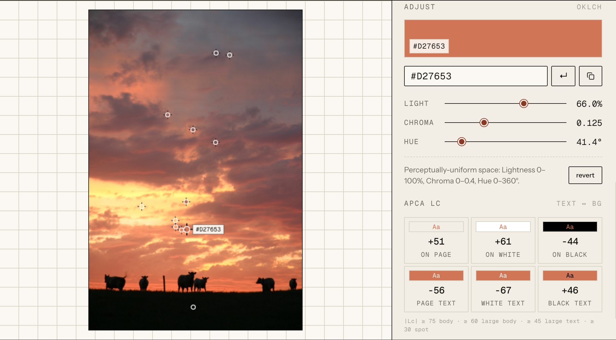
Colour swatches can be nudged in OKLCH, the polar form of OKLab (L for lightness, C for chroma, H for hue). Editing in OKLCH rather than HSL means that rotating the hue doesn’t change the perceived lightness, and pulling the chroma doesn’t accidentally shift the hue. If you’ve ever wondered why fiddling with HSL sliders never quite gives you what you want, this is also why. If you end up unhappy with any adjustments, there is a back button which resets the colour to what was originally extracted from the photograph.
Finally, contrast. Maintaining sufficient contrast between text and background colours is important for accessibility, but it’s also just more pleasant even with full vision. Web accessibility conventions for the last decade have used WCAG 2’s contrast ratio, but this doesn’t take into account perception and thus tends to fail in predictable ways. It’s based on a crude luminance division that systematically misestimates perceived contrast for mid-tones and dark-on-dark pairs. The draft replacement, APCA (the Accessible Perceptual Contrast Algorithm, by Andrew Somers), is polarity-aware and better aligns with how human eyes distinguish text from background. Chromatography uses APCA. Every swatch in your palette is scored against cream, white, and black, in both text-on-background and background-on-text directions. Finally, different text types require different levels of contrast — large title text doesn’t require quite as much contrast as small body font, for example. Different minimum thresholds for different text types are suggested at the bottom of the contrast panel. It’s worth keeping an eye on this if any of the colours in your palette are going to be paired with, or used for text.
Actually using it
The intended pipeline is pretty straightforward. Start by dropping a photo into the workspace. Select how many colours you’d like Chromatography to extract (six by default, adjustable from two to twelve). If you like what came out, happy days. You might reorder swatches by lightness or hue, hit Export, and go.
Keep in mind that k-means++ is stochastic (there’s an element of randomness every time). I deliberately kept it unseeded, so each time you click Extract, it’ll run fresh and give a different result. Usually it’s pretty stable, so the differences are slight (particularly when extracting a larger number of colours). But it means that if you’re unhappy with the starting point, you can simply click and try again. Often it’s worth rolling the dice a few times until you get a good serviceable starting point.
If you want to refine, there are two main levers. The eyedropper lets you click anywhere on the image to add a manually-chosen colour to your palette. The per-swatch panel exposes sliders for lightness, chroma, and hue, plus a revert button that resets the swatch to its original sampled value if you OKLCH too close to the sun. You can drag swatches around to reorder; you can sort them by perceptual criteria (lightness, chroma, hue, pixel weight); you can save the whole project to a JSON file that contains both the swatches and the source image, and reload it later to pick up where you left off.
When you’re done, there are several Export options: CSS custom properties for web work, JSON for anything programmatic, an R code snippet for use with ggplot, a GIMP Palette (.gpl) for desktop graphics. There is also a Markdown option for documenting the palette, and standalone HTML for sharing a rendered guide.
A note for data visualisation
A good chunk of my own use for Chromatography is academic: slides, posters, figures. On the figures side, a caveat is warranted. Palettes from photographs tend to work well only for categorical data. The colours in a photograph aren’t ordered along any single perceptual axis; they’re scattered across the colour space. This maps naturally onto categories, which also have no intrinsic order, but not onto numeric scales, which need monotonic lightness (for sequential scales) or balanced lightness around a midpoint (for diverging ones). With some work, you can coax a sequential scale out of a photograph by picking swatches along one axis and using the sliders to push the extremes brighter or darker, but ymmv. For categorical palettes, though, where the job is to be distinguishable and harmonious rather than to encode magnitude, I find that photographs often work as well as anything online.
The writeup companion
If you’re planning to reuse a palette over time, it’s useful to have some documentation of it. This is the idea behind the Markdown export option. It should record, at a minimum, a palette title for you to refer back to, a reminder of the image it came from, a list of the colours, and a description of what they’re used for (what’s the primary colour, secondary colours, highlight colour, body text colour, and so on). This doubles as a handy guide if you’re working with AI — just give Claude (or whoever) your palette guide and it can produce output matching your preferences.
The Markdown export function will give you a nice template, with your selected colour specifications pre-filled, and then you can fill in the details yourself. Alternatively, writing this kind of guide is something that large language models are quite well suited for.
I considered implementing some kind of LLM integration for this task. But Chromatology is a lightweight, static web app with no backend. It would have massively complicated things and required a heap of server side computation to implement this. It felt like an overly heavy-handed option, so I let it stand in its current, nice, client-only shape.
As a compromise, I’ve published a companion ‘prompt pack’ on GitHub. This is a carefully designed system prompt and template that you can paste into Claude (or your LLM of choice) along with your palette’s JSON export. I’ve tried to steer it away from generic sensory prose (“a rich, moody blue evokes the ocean’s depths”) or overly dramatic colour names (“Whispering Midnight Wanderlust”). The prompt asks for more restrained, descriptive language:
Two or three words maximum. They should be evocative but restrained —
the kind of name a paint manufacturer with taste would use, not the
kind a scented-candle company would. "Winter slate", "wet sandstone"
— good. "Ethereal Oceanic Dreams" — no.
The full prompt lives in the GitHub repo. Export your palette as JSON, paste both into a fresh Claude conversation, et voilà.
I also recommend asking for an HTML rendering and/or mock-up, especially if you have some nice font/typeface choices ready to go as well. I find Claude does quite a good job at this.
(It might also be fun to play around with prompt variations. What happens if you ask for overly poetic, dramatic descriptions?)
Two worked examples
I’m still in the very early days of experimenting with this app myself. But uh, here’s a little something I prepared earlier…
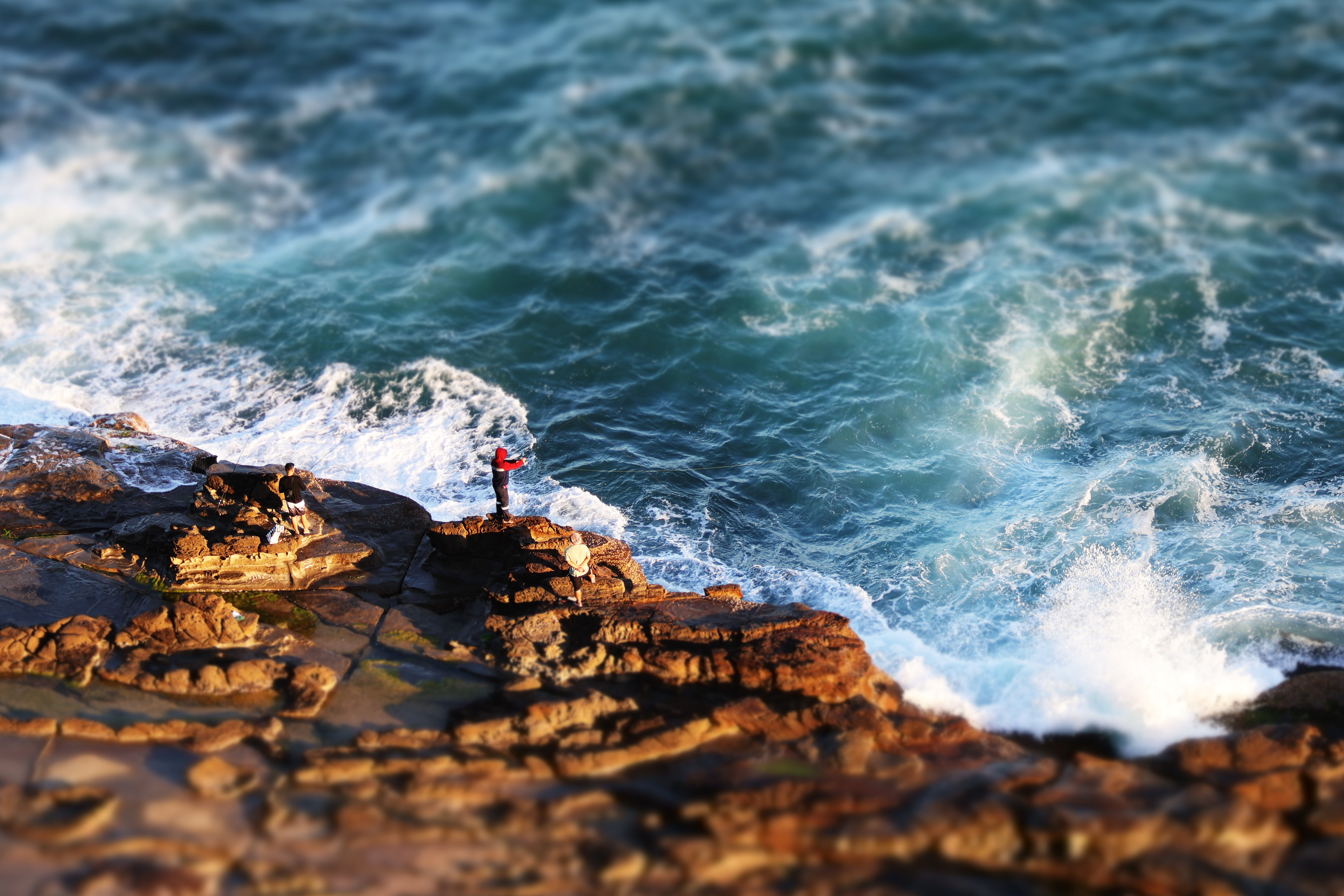
The first example is a sandstone+sea palette. I took it from the ANZAC Memorial Bridge in Newcastle. The golden afternoon sun on sandstone provides a really nice contrast to the blue ocean, and I enjoyed the bright red jacket highlight. Here’s the palette applied as a design mock-up:
This is a fairly cool-toned palette, and I’m more of a warm palette guy, so I probably wouldn’t use this myself. But still, neat.
The second example is a palette called “Fired Clay” (warm ochres, a muted aubergine, a pair of pale sandstone tones) with a full guide generated by the writeup prompt I mentioned earlier:
Which picture generated this warm, earthy palette, you ask? I’ll let you imagine some possibilities for a bit. When you’re ready, scroll to the bottom of this article.
I’m not sure what this says about the relationship between aesthetic judgement and the underlying thing being judged…
Keeping things light
This is a simple app with a specific, fairly niche use case. Still, I’m quietly pleased with just how lightweight it is, and how easy it’s been to deploy. As I mentioned, the entire thing is a React web app under 100kB. No backend, no database, no telemetry other than a simple view counter. There are no external dependencies except Google Fonts. No picture you upload gets touched by an outside server, much less saved anywhere outside your own machine. Nevertheless, there’s a nifty amount of functionality which in some respects even exceeds Adobe’s online colour palette extractor. All without being hassled by popups or login prompts.
I wouldn’t want to make too much of a broad, proselytising claim about software development on the basis of a simple colour picker. But there’s probably a lesson in here on the value of well-chosen primitives. I was able to keep things lean by standing on the shoulders of others — OKLab, k-means++ and APCA. There’s a world in which I started with classic defaults (RGB, vanilla k-means, WCAG 2), then spent enormous effort patching around RGB’s poor perceptual behaviour, adding re-roll buttons to rescue users from k-means’ local minima, and working around WCAG 2’s misleading mid-tone contrast readings. The result would’ve been considerably more surface-level complexity, and a more bloated app.
Where to next
I’ve momentarily paused development of Chromatography to give the current (beta-ish) iteration a proper test run. Several candidate v2 features are on my mind though. One option that stands out is region-based sampling: drawing a box or polygon around part of an image and extracting a palette from that region specifically, rather than the whole frame. This would make it possible to, say, extract a palette specifically from a bird or a flower, without including the background. This would further distinguish the app from other palette-from-photo tools online.
A mobile-friendly UI is another possibility. I anticipate Chromatography will be most useful on desktop anyway, but currently it breaks completely on mobile, which feels sad.
There are other candidates: chroma-preserving gamut mapping, data-visualisation-specific palette generation modes, seeded extraction for reproducibility, persistence via IndexedDB. But I’ll wait a bit and see where the main friction points are. Feel free to make feature requests via GitHub issues.
Links
Chromatography is free and lives at chromatography.pages.dev.
The code is open source (GPL v3) on GitHub; bug reports and pull requests welcome.
If you find it useful and feel like chipping in a few quid toward ongoing development, my Ko-fi page is here.
If you extract a palette you’re fond of, I’d love to see it. Send a screenshot or a link through any of the usual places. Maybe I can create a central repository of palettes, if anyone feels inclined to share their work!
 “Fired clay” indeed.